With the recent outbreak of the COVID-19 Delta strain in Australia and lockdowns affecting more than half the population, tuning into updates from state premiers and reviewing the state health COVID dashboard has become a daily ritual for many.
But regardless of how useful (or how depressing) the daily numbers may be, there is no reason why we can’t use the rich amount of publically available data to create our own dashboards that reflect our individual requirements. These may include:
- A more detailed breakdown of new cases: I.e How many people were infected in isolation or in the community?
- Historical trends: How have cases increased in recent days or months?
- Cases by location: Which councils or postcodes have seen the greatest increases? How has the area in which we reside or go to work been affected?
Using Power BI or similar dashboarding/BI platforms (i.e. Amazon Quicksight, all these are possible and more. Once the dashboard is created, it can be scheduled to update daily, providing you with the information you need to navigate the lockdown and make the decisions that are best for you and your family.
Building Charts and Accessing Data Sources
- Cases by source of infection - Line and stacked column chart
- Source: CovidLive.com.au
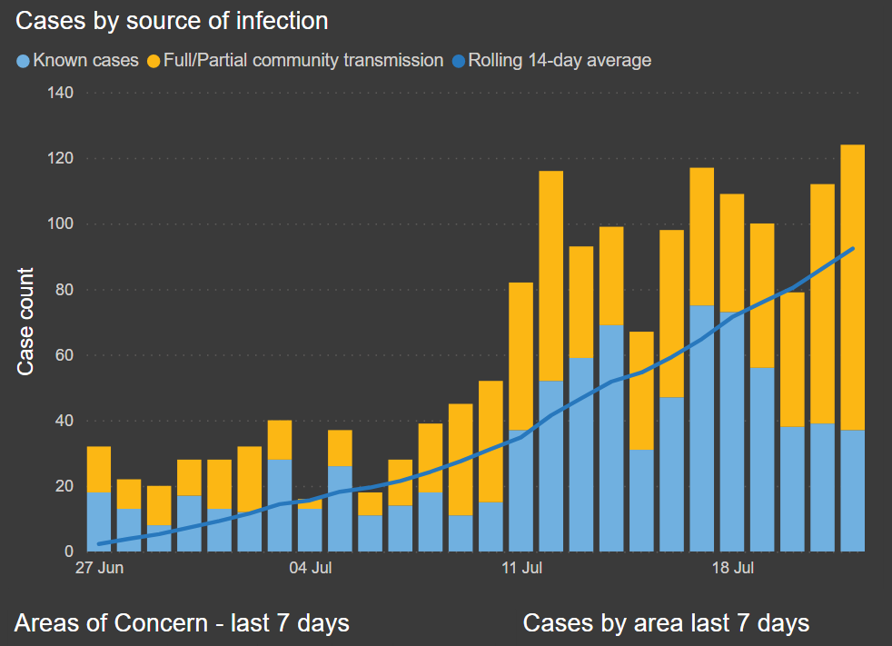
This chart combines two charts showing daily new cases from covidlive.com.au. The rolling average line is a Power BI Measure to see if the numbers are trending in the right direction.
- Cases in Sydney last 7 days - Map
- Source: NSW Health API, Australian Postcode Database
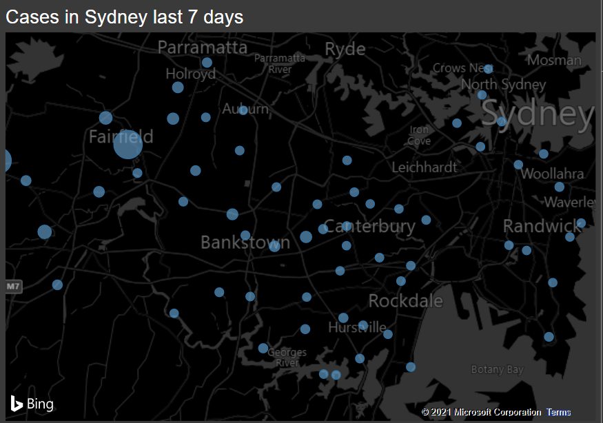
This chart combines case data from NSW health with a postcode database which provides the coordinates and suburb names for use in the map. Unfortunately the size of the bubbles in this default Bing map does not seem to accurately reflect the case count. The other option - ArcGIS Maps - gave me occasional authentication errors, so the Bing map remains, for now!
- Areas of Concern - last 7 days - Table
- Source: NSW Health API
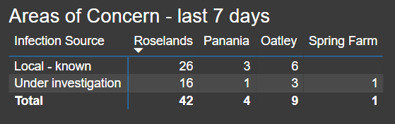
This table uses a measure for each area to filter for specific postcodes to achieve greater accuracy than LGA, which in some cases are very large. I live in Roselands so in this table I’m filtering for the Roselands postcode of 2196, together with postcodes in the surrounding area. The same has been repeated for the areas where my family and close friends reside.
- NSW Vaccine Doses vs Tests - Line chart
- Source: CovidLive.com.au
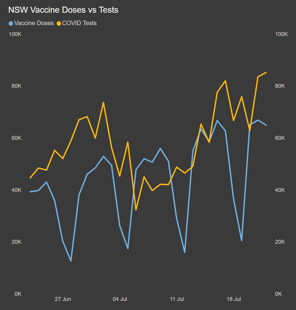
Here we combine vaccine doses and COVID tests to explore how these numbers are changing over time. We can clearly see that the rate of vaccine doses has increased by over 50% in 3 weeks, and COVID tests are up too - coinciding with the requirement for workers travelling outside of Fairfield, Canterbury Bankstown and Liverpool LGAs to be tested every 3 days.
- LGAs of concern - Table
- Source: NSW Health API
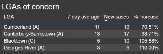
This table highlights LGAs that have seen substantial increases in new cases above the 7-day average, filtered for a daily increase above 10% and 3 or more new cases, bringing attention to potential hot-spots in the coming days if the trend continues.
- Cases by area last 7 days - Donut Chart
- Source: NSW Health API
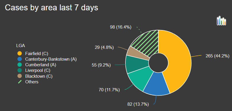
Simple but effective visual to understand where most of the cases have been over the last 7 days.
- Hospital Admissions & Deaths - Stacked Column Chart
- Source: CovidLive.com.au
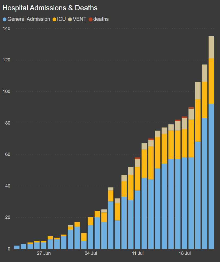
Here we combine two tables with hospital admissions and deaths data to produce a single chart, which immediately demonstrates the seriousness of the Delta strain, with 5 deaths and 43 people currently in ICU or on a ventilator.